
Table of Contents
Color is an essential element of design, particularly in printing. Color can evoke emotions, convey a brand’s message, and influence customers’ purchasing decisions. In this blog post, we will discuss the importance of color in printing and its impact on marketing and branding.
Color Psychology and its Impact on Customers
Color psychology is the study of how colors affect human behavior and emotions. Different colors can evoke different emotions and moods, making them a powerful tool in marketing and branding.
For example, red is associated with passion, excitement, and urgency, making it a popular color for sales and promotional materials. Blue, on the other hand, is associated with calmness, trust, and reliability, making it a popular color for finance and technology brands.
Understanding the psychology of color can help you choose the right color scheme for your print materials and effectively convey your brand’s message to your target audience.
The Power of Color in Printing


Grabbing Attention and Standing Out
The impact of color on print materials cannot be overstated. Colorful and eye-catching print materials can grab customers’ attention and make your brand stand out from the competition.
Using bold and bright color in printing can help to create a memorable and positive first impression for your brand.
Conveying Information and Enhancing Design
Additionally, using color in print materials can help to convey important information and enhance the overall design. For example, using different colors to highlight key features or benefits of a product can make it easier for customers to understand and remember this information.
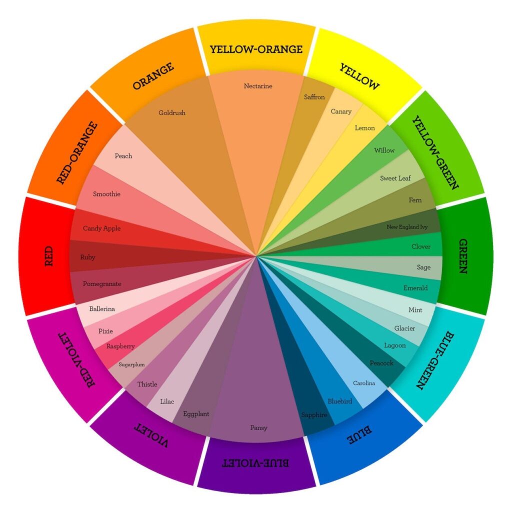
Role of Color Combination in Printing
There are different types of color combinations and nailing the right one for your brand improves effectiveness of your stationery. Different color combinations can evoke different moods and emotions and influence customers’ purchasing decisions. Here are some common types:
- Complementary colors: Complementary colors, such as blue and orange or purple and yellow, can create a sense of harmony and balance.
- Analogous colors: Analogous colors, such as blue and green or yellow and orange, can create a calming and peaceful mood.
- Contrasting colors: Contrasting colors, such as black and white or red and green, can create a sense of excitement and urgency.
When choosing color combinations for your print materials, consider the emotions and moods you want to evoke and the message you want to convey to your target audience.
Importance of Color Quality in Printing
- High-Quality Materials: Finally, it’s important to consider color quality and printing techniques when creating print materials. Using high-quality ink and paper can enhance the vibrancy and longevity of your colors, ensuring that your print materials remain eye-catching and attractive for a long time.
- Accurate Colors: Additionally, using advanced printing techniques such as spot color printing or digital printing can help to create more precise and accurate colors, ensuring that your brand’s colors are consistently reproduced across all print materials.
Spot color printing involves mixing specific ink colors to match your brand’s colors precisely. This method is ideal for brands with a specific color palette, as it allows for greater color accuracy and consistency.
Digital printing, on the other hand, uses digital files to print directly onto the paper or material. This method is ideal for short-run print jobs, as it is cost-effective and allows for more customization and flexibility in color choices.
Importance of Color Consistency in Branding
Color consistency is critical for branding and recognition. Consistently using the same colors across all print materials, including business cards, brochures, and packaging, can help to build brand recognition. It creates a cohesive brand experience for your customers.
When choosing colors for your brand, consider your brand’s message, target audience, and values. Choose colors that resonate with your audience and reflect your brand’s values and personality. Consistently using these colors across all print materials can help to create a memorable and recognizable brand identity.
Conclusion
In conclusion, the importance of color in printing cannot be overstated. Color can evoke emotions, convey a brand’s message, and influence customers’ purchasing decisions.
By understanding color psychology, you can create eye-catching and effective print materials to build a strong brand.
If you want to design and printing high-quality business stationery for your business, Request a quote here or call today at +91 9828074688 for more information.

